Better Functionality #
- I integrated some nice typographic styles (you’re lookin’ at 'em now!) to make everything more readable and generally nicer to look at. Previously headings and text were spaced in fairly crazy ways, and now things are a little more sensible.
- Tables of contents have been added to all other pages, and they’re a little nicer to look at as well due to some fancy styles.
- Headings now have permalink symbols that you can copy to link someone directly to a section of a page. Feel free to use those instead of just linking to the top of a page if that helps.
- New semantic styles that I can use to compose some slightly nicer views of information. Even though the typography stuff improved the basic elements like paragraphs and lists, they’re still a little boring and could present the information better. Now I’ve got some nice tools to do that without having to decend into CSS semi-hell.
- The footer now has a link to the Discord. You’re probably in there already if you’re seeing this post, but whatev’.
- The game pages list page now has a functional breadcrumb, tag pills, and some other nice styling changes.
- Page headings have an improved breadcrumb with game series and mode now.
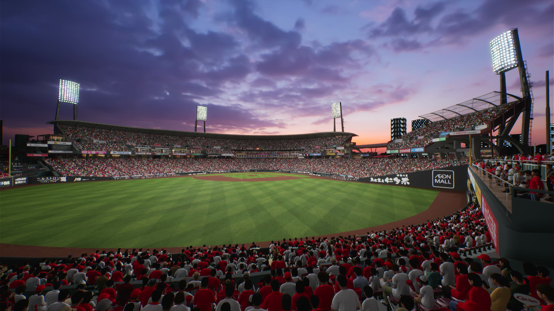
- I pulled a bunch of stadium images out of the game for headers, so maybe some pages won’t just use that same school courtyard image. We’ll see if I get around to fixing up the old pages. You can see one from the Hiroshima Carp stadium on this post above. (Is it still the Mazda Zoom Zoom Stadium? Such a silly name…)
Updated Pages #
- Every content page for a game has been updated with a table of contents and improved typography.
- Special Player Skills
- Practice Activity Cards
- During a Game
- Post Game
- Helpful Videos
- Day Off Activity
- Bookstore Activity
- Convenience Store Activity
- Schedule Improvement
Maybe there’s some other stuff that I’ve forgotten in the last couple of days.
Hope y’all are knocking the cover off the ball! (I watched The Natural the other day. Such a silly movie…)
–HB
